This is the first article to follow-up on my why "Why Is Internet Explorer Better?".
Today's article is going to discuss how Internet Explorer deals with margins. To explain this weird and frustrating issue, I am going to build a photo gallery and break it down into several steps.
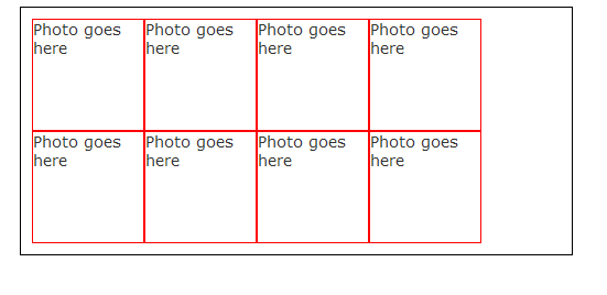
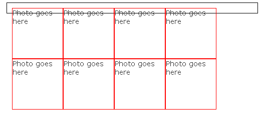
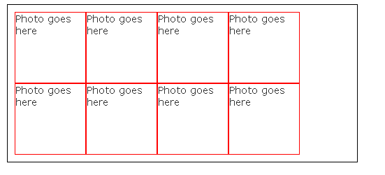
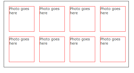
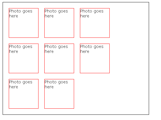
The first step is to create our HTML for our photos. In this example, I am going to use straight HTML, where you would normally query a database for the photos and build it through a loop. <div class="photo">Photo goes here</div> <div class="photo">Photo goes here</div> <div class="photo">Photo goes here</div> <div class="photo">Photo goes here</div> <div class="photo">Photo goes here</div> <div class="photo">Photo goes here</div> <div class="photo">Photo goes here</div> <div class="photo">Photo goes here</div> </div> Next up is our CSS. This CSS will just get us started, we will add more style and build it up to our finished product. #photos { border: 1px solid #000000; padding: 10px; width: 480px; } .photo { border: 1px solid #FF0000; float: left; height: 100px; width: 100px; } </style> The above style generates the following in Internet Explorer 7: This is what it looks like in Mozilla's Firefox: As you can see it doesn't quite look as good. The black border around our gallery doesn't expand to its full height. The reason is somewhat difficult to explain in words, however, I'll give it my best shot. Because our photo <div>'s are floating, Mozilla cannot properly calculate how high the containing <div> is. In fact, if we didn't have the 10 pixels of padding, the black lines would be touching each other. There are two ways to fix this problem (that I am aware of): Solution 1 is an excellent solution if you want a fixed height. In our case we will go with solution 2 because as our gallery grows we want the containing box to grow with it. After our last <div class="photo"> add the following code (make sure it's before the closing </div> of our photos): If you refresh in Mozilla, it will now look like Internet Explorer. The next thing we want to do is update our photo class and add some spacing between them. This can be accomplished by adding some margin all around it. Our photo class now looks like this: border: 1px solid #FF0000; float: left; height: 100px; margin: 10px; width: 100px; } Again, we have some style differences between our two browsers. Internet Explorer looks like this: And Firefox looks like this: In Firefox the following is happening: If you add the following numbers up: 100 + 10 (left margin) + 10 (right margin) = 120 pixels. Multiply this number by 4 (because we want 4 photos across) = 480 pixels. Wait a second, isn't our <div> containing our photos 480 pixels wide too? It sure is, however, Mozilla has determined that our 4 <div>'s plus the padding on our containing <div> isn't enough room to fit properly so it wraps it to a new line. As per usual, Internet Explorer doesn't follow standards and when it calculates how many <div>'s can fit in a row it doesn't take the margins into calculation, so it's simply 100 pixels multiplied by 4, which leaves "plenty" of room. To solve this problem, we simply need to increase the width of our containing div to allow for a bit of extra room. Update this line in our #photos style: and change it to: Now if you save the file and refresh, both browsers look identical and our album is symmetrical in all browsers. I wish there was a better way to fix these types of problems, unfortunately because web browsers cannot follow one standard this is just one example of the million and million of differences between the two. Hopefully this article has helped you out of a tough situation or avoid one in the future! From my experience when I encounter an issue like the one above, I always start by attempting to understand the problem that is occurring. After a bit of thinking with this one, it was clear that Mozilla was adding the margin into it's calculation and Internet Explorer was not. If you haven't ready my article on the Mozilla add-on "Firebug", I would suggest doing so because when I original encountered this problem, I adjusted the CSS dynamically in Firebug to help me determine my solution. Published on Feb 16, 2009 Tags: The Ultimate CSS Tutorial for Beginner Programmers
| Mozilla
Did you enjoy this article? If you did here are some more articles that I thought you will enjoy as they are very similar to the article
that you just finished reading.
No matter the programming language you're looking to learn, I've hopefully compiled an incredible set of tutorials for you to learn; whether you are beginner
or an expert, there is something for everyone to learn. Each topic I go in-depth and provide many examples throughout. I can't wait for you to dig in
and improve your skillset with any of the tutorials below.
<div id="photos">
<style>
<div style="clear: both"></div>
.photo {
width: 480px;
width: 490px;
Related Posts
Tutorials
Learn how to code in HTML, CSS, JavaScript, Python, Ruby, PHP, Java, C#, SQL, and more.

